How to design for the stage, not the page
Most decks are designed to be read. Whatever you want to say is on the slide - give someone the deck and they'd get the whole picture without you in the room.
Event decks are different. You're presenting it. The slide doesn't replace what you're saying. It supports it. Let’s look at how we should design for the stage.
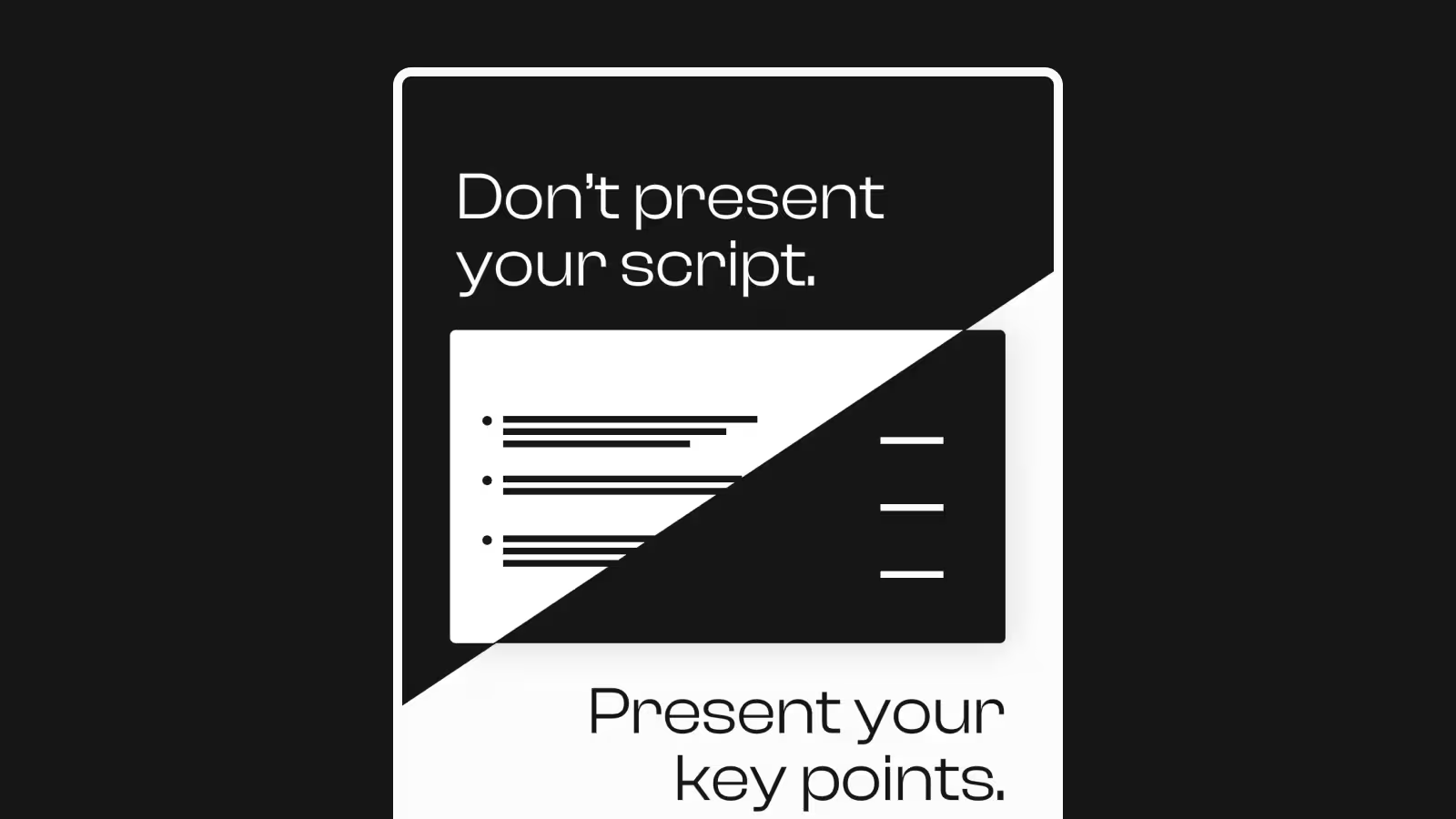
One idea per slide
In a reading deck, you group things together. Easier to reference, easier to scan. But when you're presenting, a packed slide works against you - the audience starts reading and stops listening. And if if you try to squeeze in too much, the text might not even legible from the back of the room.
For event presentations, more slides isn’t a bad thing. It helps you pace the presentation. A new slide signals a new point. Stay on one dense slide too long and your audience loses track of where you are in the argument.
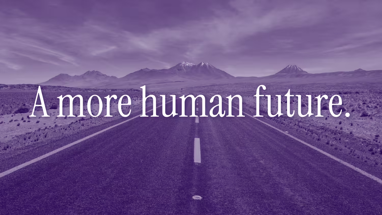
We designed an AI keynote that showcased key ideas with stylised backgrounds, allowing each slide to have a full impact.
Keywords instead of sentences
Words on a slide aren't there to communicate. You are. Think of them as concepts — prompts that prime the audience for what you're about to say, not substitutes for saying it.
There's a common assumption that putting your spoken content on the slide reinforces the point. It doesn't. This is called the redundancy effect - when the same information hits us through two channels at once, spoken and written, it overwhelms rather than reinforces. Research shows that in this situation, you're better off either muting the speaker and just reading off the slides, or closing your eyes and just listening. Doing both at once is the worst of both worlds.
This is where keywords come in. They give the audience an anchor without competing with your voice.
Animate for meaning
Reading decks are static. Event decks don't have to be. Animation is one of the few tools you have that a document never will.
The obvious use is engagement — a transition, a reveal, something that keeps the room alive. But the more powerful use is meaning. A well-placed animation can show a relationship between two ideas, or can retain one idea across multiple slides.
We illustrated the enormity of non-regulated standard and showed that the gap between it was cost
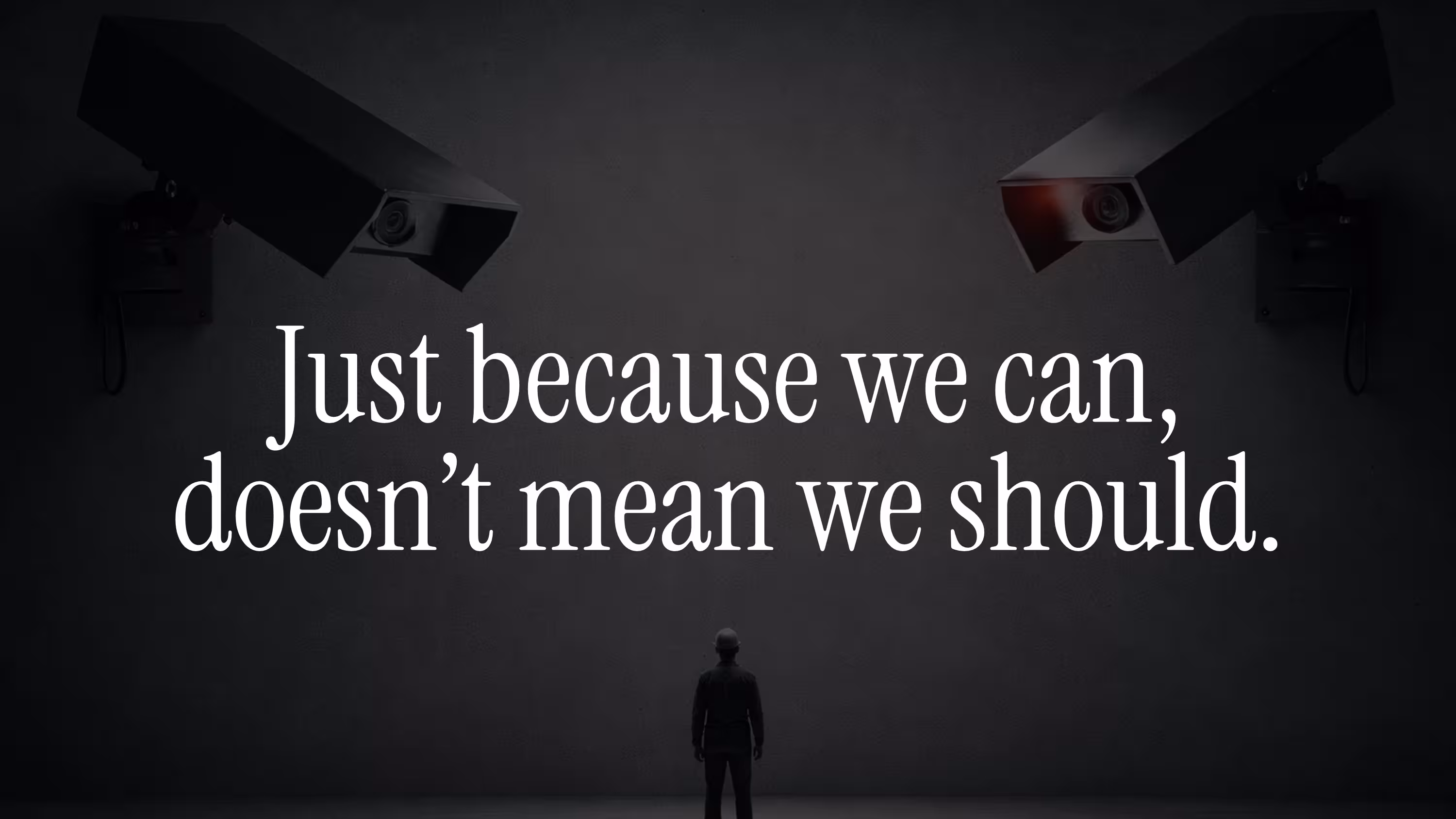
We highlighted a problem through a personal story but then expanded it show that many people faced the same problem
Design for the stage
The whole point of an event presentation is that there's a person on stage. The slides are there to support what that person is saying, not to say it for them. When you put one idea on a slide and use animation to bring it in at the right moment, you're not just tidying up your design - you're controlling the pace of the room. The audience sees what you want them to see, when you want them to see it. You're leading them through the argument, beat by beat, instead of putting the whole thing on screen and hoping they follow along.\
Heading 1
Heading 2
Heading 3
Heading 4
Heading 5
Heading 6
Lorem ipsum dolor sit amet, consectetur adipiscing elit, sed do eiusmod tempor incididunt ut labore et dolore magna aliqua. Ut enim ad minim veniam, quis nostrud exercitation ullamco laboris nisi ut aliquip ex ea commodo consequat. Duis aute irure dolor in reprehenderit in voluptate velit esse cillum dolore eu fugiat nulla pariatur.
Block quote
Ordered list
- Item 1
- Item 2
- Item 3
Unordered list
- Item A
- Item B
- Item C
Bold text
Emphasis
Superscript
Subscript